Porsche Unveils Striking New Logo in Celebration of 75th Anniversary
Revving into the future! Porsche unveils a mesmerizing new logo, bridging 75 years of iconic design and innovation.
In celebration of its illustrious 75-year history, Porsche has revealed a redesigned logo that elegantly merges the brand's rich heritage with its promising future. The German automaker announced the change, emphasizing subtle color modifications and a captivating three-dimensional effect that adds depth and character to the iconic crest.
Suggested: Maximizing Your Profit: Tips for Selling Your Car Online in India Safely and Efficiently
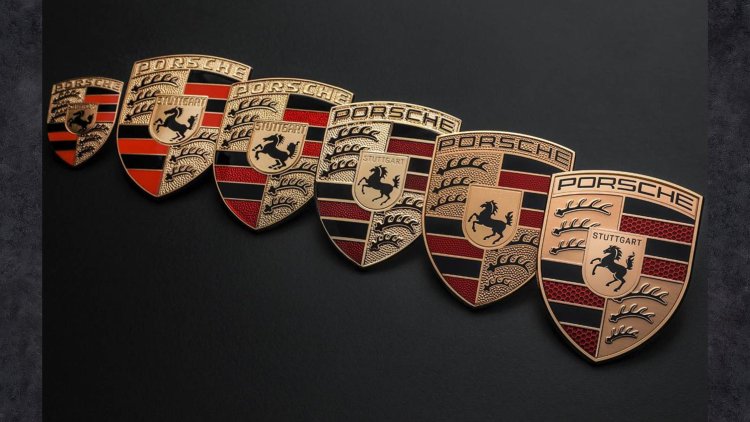
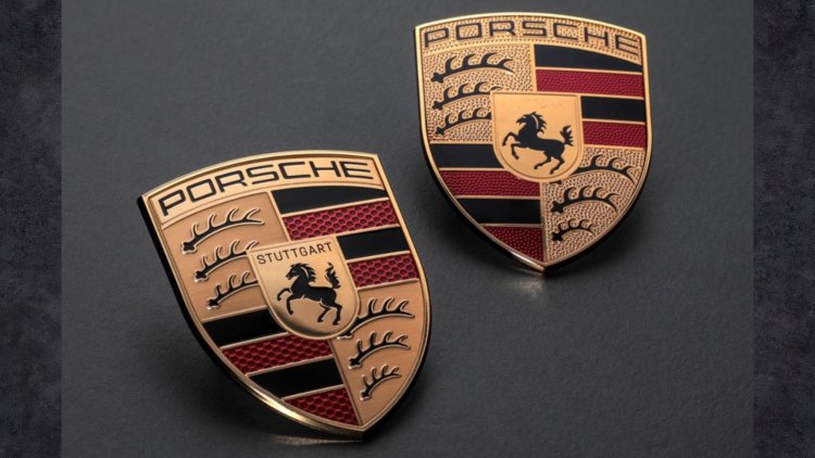
Porsche's outgoing logo, introduced in 2014, served as an evolution of the emblem that had adorned their vehicles since 1952. However, the new logo symbolizes a significant shift while remaining instantly recognizable to enthusiasts and loyal customers. The forthcoming 2023 Porsche Panamera will be the first vehicle to showcase this refreshed emblem, with dealerships transitioning to the new visual identity in tandem.
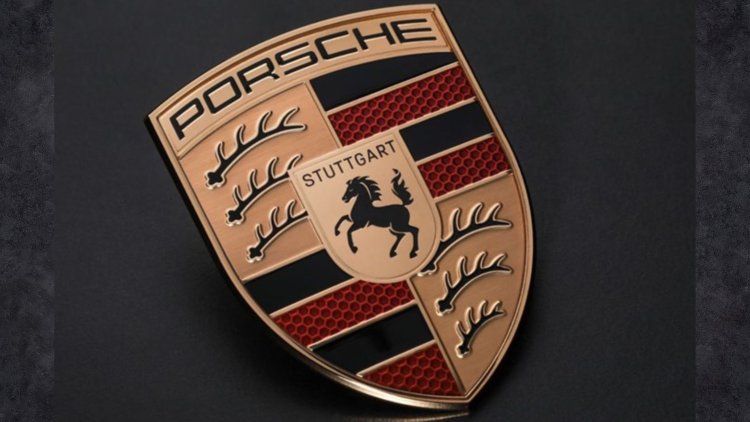
The design process behind the logo spanned three years of meticulous craftsmanship, resulting in a more pronounced silhouette that effortlessly bridges the historical legacy and future aspirations of the brand. The top of the crest has been widened, while the bottom has been narrowed, imparting a three-dimensional aspect. Various elements have been recessed or elevated to create this captivating effect.
Subtle alterations have also been made to the colors within the logo. The gold hue, synonymous with Porsche, now carries a slightly darker tinge, adding sophistication and refinement. The lettering has undergone a modern makeover, featuring a simpler typeface with a sleeker, thinner font. This update lends the logo a contemporary aesthetic while maintaining a touch of tradition. Similarly, the antlers, inspired by the coat of arms of the Stuttgart region, have received a similar treatment to align with the logo's overall vision.
Porsche's attention to detail extends to the red bands, which now sport a captivating honeycomb structure. This design element serves as a symbolic representation of the lightweight construction employed in Porsche's renowned sports cars. The hexagonal shapes exhibit a stunning 3D effect, achieved by incorporating subtle variations of red within the honeycomb's walls. The web of honeycomb itself features a slightly lighter tone, further enhancing the visual impact.
The focal point of the logo, the horse, originally derived from Stuttgart's city mascot, has been imbued with a more dynamic and spirited appearance. Designers have meticulously crafted the horse to exude the qualities of a thoroughbred, radiating power and elegance. Additionally, the 'Stuttgart' lettering above the horse has been reintroduced, now displayed in a striking black color, emphasizing the brand's deep-rooted connection to its birthplace.
Matthias Kulla, Porsche's director of design management for its sports car programs, highlighted the desire to create a logo that evokes not only visual appeal but also a tactile experience. The three-dimensional quality of the emblem adds a captivating dimension, elevating the overall impact and resonance.
Robert Ader, chief marketing officer at Porsche, expressed the brand's intentions to strategically employ the new crest to emphasize emotional highlights. Furthermore, he highlighted the increased significance that the Porsche lettering will now assume.
As Porsche embarks on the next chapter of its storied history, the striking new logo stands as a testament to the brand's unwavering commitment to innovation, excellence, and the relentless pursuit of automotive perfection. With its fusion of tradition and modernity, the emblem encapsulates the spirit of Porsche, capturing the hearts and imaginations of enthusiasts worldwide.